
A room that exhales
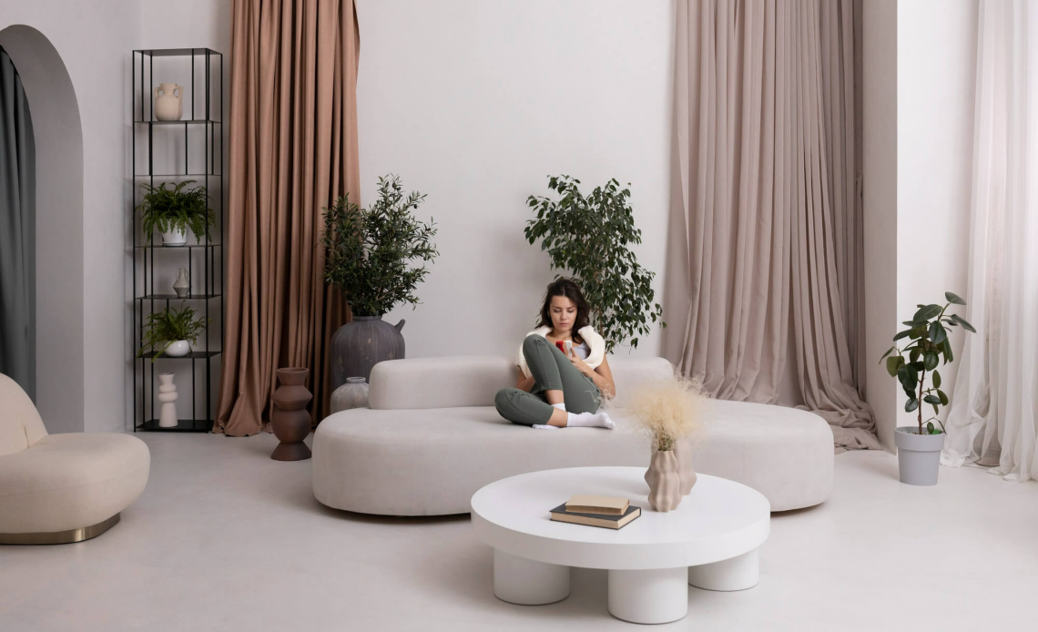
Late afternoon light drops across a sofa, the walls look a little warmer, and the room seems to exhale. Colour does that. It sets the pace of a day, the way sound and light do, and it shapes how the living room holds people after work or on a slow Sunday. Calm spaces share a few traits. They avoid hard contrasts, they favour hues that sit close together on the wheel, and they rely on texture as much as tone.
The aim is not to silence the room. It is to steady it. A modern living room can be lively with books and art, yet feel composed when the colours are tuned with care. Many designers say this starts with a base that does not shout, then layers in small shifts of depth to guide the eye. The choices are practical as well as aesthetic, because different paints, fabrics and finishes reflect light in ways you can feel.
Begin with soft neutrals that hold the space
A gentle neutral gives the room its backbone. Warm whites with a hint of ochre or clay read soft in morning light and do not turn stark at night. Light greige, a mix of grey and beige, suits open plan homes where the living area meets the kitchen. It balances cool floors like polished concrete and softer surfaces like linen. Pale taupe does a similar job when you want a touch more depth behind artwork or timber.
Keep trim and walls close in tone if you prefer seamless edges. If you like a little definition, shift the trim one step lighter. Many owners find that matte finishes on walls reduce glare and make colours feel quieter, while a low sheen on skirting boards is easier to wipe. For ceilings, a slightly lighter version of your wall colour lowers contrast and keeps your eye level, which helps the room feel restful. If you plan a feature above, ideas for bold ceiling design show how tone and sheen change the mood without adding clutter.
Greens and blues that breathe without feeling cold
Soft greens are dependable in living rooms that need calm without blandness. Sage, eucalyptus and muted olive bring a garden note indoors, which suits homes that open to decks or courtyards. They pair well with oak floors and woven grasses, and they sit easily under indoor plants. Blues can be peaceful too. The key is gentleness. Think chalky duck egg, misty sky or a weathered denim rather than a sharp primary. These colours cool a room that gets hot afternoon sun, and they support long sofas and low storage units without making them feel heavy.
If you prefer white walls, you can still lean on colour with textiles. A slate throw on a sand sofa, a pair of cushions in soft teal, and a rug with fine, broken stripes can carry as much weight as paint. Curtains in a textured weave, chosen from the range of window treatments for privacy and light, will filter glare and soften the palette at once.
Earthier notes for warmth and evening comfort
Earth tones ground a space. Terracotta, caramel and mushroom read warm under lamplight and make winter evenings feel close. Use them in measured areas. A clay toned wall behind a bookcase, a rust wool rug, or timber with a mid brown stain can shift the whole room without repainting every surface. These hues also flatter skin tones, which is why they suit spots where people sit and talk.
Balance matters. If you choose a cinnamon sofa, keep nearby walls and curtains quiet. If your floors are already dark, bring in lighter textiles so the room does not feel heavy at night. Small pieces carry colour well. A stack of cork side tables, a leather ottoman, or a ceramic lamp with a sand glaze adds warmth without crowding the eye.
Build gentle contrast for depth and interest
Calm does not mean flat. A little contrast helps a room feel deliberate. Many designers aim for a small spread between the lightest and darkest elements, then add one deeper note to anchor the view. In practice, that might be pale greige walls, a natural linen sofa, and a charcoal media unit that blends with the television. Storage that sits low and dark reduces visual noise, and pieces like TV unit designs with hidden storage keep cables and devices out of sight, which also quietens the room.
Artworks and books are useful here. Frames in dark wood or black metal add a fine line that separates wall from image without dominating. If you want an accent colour, keep it close to your main palette. A deep pine green vase beside a sage wall reads connected. A cobalt cushion in a room of quiet blues might feel like a jump.
Light matters more than you think
The same paint can look soft at dawn, dull at noon, and creamed honey at dusk. Study your light before you choose. North facing rooms in Australia often run bright and warm, so they can handle cooler neutrals and gentle blues. South facing rooms benefit from creams and clays that add back a sense of daylight. Sheer curtains filter glare and sharpen colour, while solid drapes, lined well, add calm once the sun goes down. A living room that shares space with the kitchen may also pick up reflections from glossy benchtops and appliances, which can push a white towards blue. Surfaces talk to each other.
Artificial light shapes colour at night. Warm globe temperatures tend to flatter earth tones, cool globes can make greens and greys feel crisper. Many homeowners now layer ceiling lights with floor lamps and wall lights so they can change the mood without changing the paint. Reflective finishes, such as satin on sideboards or a low sheen on painted shelving, bounce light around and help small rooms feel open.
Fabrics, timber and stone that carry colour well
Texture does a lot of the calming work. Bouclé and heavy linen soften sharp lines and catch light in a gentle way. Wool rugs muffle sound and take dye evenly, which keeps colours subtle. Flat weave rugs show pattern without weight. If your palette leans cool, ash, oak and pale walnut will keep it steady. If you sit in the warmer camp, try messmate, Victorian ash with a honey stain, or American oak that leans to caramel.
Stone should sit quietly with your scheme. Sand toned limestone feels warm underfoot and flatters mushroom and taupe. Grey marbles with veining pick up blue and green accents. If you plan a suspended feature like a lowered tray above the seating zone, a gypsum false ceiling painted a half tone lighter than the walls can define the area without stealing attention.
How to test, tweak and live with your palette
Paint the largest samples you can live with for a week. Card swatches are not enough. Put colour in two or three spots and watch it through a full day. Stand back in the evening with the lamps on and look again in the morning. If a test patch leans green or pink in a way you do not like, try the next shade up or down the strip. A small shift in depth often fixes an undertone that bothers you.
Think about maintenance. Matte walls hide small scuffs but need gentle cleaning. Semi gloss marks more easily but wipes well. If you plan to do the work yourself, a refresher on painting for beginners can help you prepare walls, choose rollers, and cut clean edges, which all affect how colour reads. When the job is done, bring the materials back into the room in stages. Start with the sofa and rug, then add cushions, throws and lamps. Edit as you go. Calm grows when you remove as much as you add.
A colour story you can live with
The living room earns its place as a daily setting for small rituals. Colour sets those scenes. A steady base, a breath of green or blue, a few earth notes, and light that flatters them all. None of it is loud. The effect is felt more than it is seen. When you sit down at the end of the day and the room meets you where you are, you know the palette is doing its quiet work.