
Blush paint has quietly shifted from nursery pink to one of the most versatile neutrals you can put on a wall. Used well, it makes a room look softer, warmer and more flattering without ever feeling sugary or childish.
Major paint brands such as Benjamin Moore, Sherwin-Williams, Farrow & Ball, Behr and Clare now treat blush as a sophisticated neutral that works in living rooms, kitchens, bedrooms and even bathrooms.
The key is undertone. Some blushes lean creamy and beige, others lean peach or terracotta, and a few carry a whisper of gray that keeps them elegant and grown up. Below are fifteen tried and trusted blush shades designers reach for when they want a room to feel calm, flattering and current.
How to choose a blush?
Before you fall for a color chip, look at three things in your room.
First light. North facing rooms and spaces with little daylight often need a warmer, peachier blush to stop them feeling flat. Sun drenched rooms can handle the cooler, slightly grayed pinks without looking cold.
Second, what is happening on the floor and with large furniture. Wood with orange or red in it, terracotta tiles, brass and rattan love earthy blush tones.
Gray stone, chrome and crisp white fabrics tend to suit blushes with beige or gray in the mix rather than overtly peach or coral tones.
Third, ask yourself how pink you want it to read. If you are nervous, start with a blush that is marketed as a neutral or off white with a pink cast.
If you already love color, you can push into deeper rose tones for a cocooning effect, especially in bedrooms and snug living rooms.
Always test on at least two walls, at full height, and live with it for a couple of days. Blush shades shift a lot between morning and evening light.
Read More: How To Decoupage On Wood Furniture?
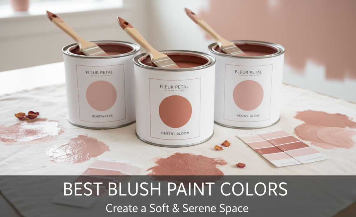
15 best blush paint colors
First Light 2102-70
From Benjamin Moore, First Light is a pale, optimistic pink that was named the brand’s Color of the Year for 2020.
It was created as a fresher alternative to plain white or beige, with just enough rosy pigment to warm a room without shouting pink.
Use it when you want a light, airy backdrop that still flatters skin tones. It is lovely in small apartments, open plan living rooms and any space where you might otherwise default to white.
Pair it with soft grays, pale oak and black accents to keep the look crisp.
First Crush CSP-310
First Crush is a modern answer to “barely there” blush. The brand describes it as a tender neutral with a soft blush undertone that adds warmth while still behaving like a versatile off white.
This is an excellent choice if you do not want your walls to read obviously pink but you like the idea of a gentle rosy cast.
It works beautifully in whole home schemes and is particularly good in bedrooms, ensuites and light filled hallways where its subtle warmth comes through.
Warm Blush 892
Warm Blush does exactly what the name promises. It is a pastel pink suffused with a soft glow that feels charming rather than cute.
The color is part of Benjamin Moore’s classic collection and is often described as having an irresistible warmth.
Use Warm Blush where you want a romantic but grown up feeling, for example in a primary bedroom or guest room. It loves linen, vintage wood and warm metals. In low light rooms it reads cozy rather than gray.
Tissue Pink 1163
Tissue Pink is a graceful, flattering blush that designers often treat almost like a beauty filter for a room. The brand calls it a blush with a soft, glowing quality, and that is how it behaves on the wall.
Because it has a gentle radiance, it is a lovely choice for dressing rooms, bathrooms and spaces where people see themselves in mirrors. Pair it with off whites, marble and polished nickel for a quietly luxurious feel.
Read More: How To Make DIY Chalk Paint?
Melted Ice Cream 2095-70
Despite the playful name, Melted Ice Cream is surprisingly sophisticated. Gray tones in the formula pull the pink back into a relaxed, adaptable shade that never feels too sweet.
Reach for this if you want blush that works with cooler materials such as concrete, gray upholstery or stainless steel. It can make contemporary spaces feel softer without losing their modern edge.
Sharon Rose 039
Sharon Rose sits in dusty rose territory rather than baby pink. Benjamin Moore describes it as a dusty rose deepened by a touch of pink, and recent trend coverage calls it a timeless blush that adds depth while still brightening a room.
It is a strong option if you want more color on the wall but still plan to layer in patterned textiles or art. Try it in dining rooms, entryways and moody home offices, especially with dark wood and antique brass.
Intimate White SW 6322
Intimate White from Sherwin-Williams is a very soft pastel with a hint of pink and beige.
The manufacturer describes it as a pink pastel with the gentle touch of a spring breeze and suggests it for bathrooms and nurseries when you want a delicate mood.
In real rooms it reads like a warm white with a blush cast. Use it where you need flexibility with lots of different textiles and finishes, such as family rooms or rental properties, but want more charm than a standard cream.
Malted Milk SW 6057
Malted Milk is a blushing neutral with soft red undertones that give it a quiet warmth.
Sherwin-Williams highlighted it as a Color of the Month and describes it as a flexible neutral with a dash of red that meshes with many design styles.
This shade leans more beige than pink, which makes it ideal for open plan spaces and traditional homes where you want to warm up the walls without jumping fully into pink. It is especially good with medium wood floors and woven textures.
Setting Plaster No. 231
Setting Plaster is a modern cult classic. Farrow & Ball describe it as a dusty plaster pink inspired by the soft blush of newly plastered walls, softened by yellow pigment so it feels gentle and historical rather than sugary.
It is beautiful in period properties and contemporary homes alike. Think living rooms, dining rooms and snug sitting rooms where you want warmth and character.
It pairs wonderfully with dark woods and deep browns for a rich, European feel.
Pink Ground No. 202
Pink Ground is one of the most versatile blush paints on the market. Farrow & Ball describe it as a dusty pink with a generous dose of yellow pigment that creates the softest blush of color and a warm, soothing finish without any saccharine feel.
Use it where you might otherwise choose a warm neutral. It wraps a room in a gentle glow and is especially effective in through spaces such as hallways and open plan living areas.
Calamine No. 230
Calamine is a delicate pink with a touch of gray, named after the soothing lotion many of us remember from childhood.
That hint of gray keeps it from feeling babyish and helps it stay fresh and subtle on the wall, a quality Farrow & Ball emphasize in their own descriptions and press coverage.
It is a superb choice for bathrooms, guest rooms and small bedrooms where you want a gentle, flattering color that still feels calm. The gray note also helps it team well with white sanitaryware and chrome.
Sulking Room Pink No. 295
Sulking Room Pink is a deeper, moodier take on blush. Farrow & Ball describe it as a romantic, muted rose with enormous warmth and a powdery softness, often associated with boudoir style rooms.
On the wall it feels like an earthy rose rather than a pastel. It is stunning in dining rooms, bedrooms and small sitting rooms where you want an intimate, enveloping atmosphere. Combine it with off black or deep aubergine accents for drama.
Rosewater S170-2
Behr’s Rosewater is a light, dusty pink described as comparable to light filtered through a pink glass vase and classed as a dusty, light toned red yellow hue.
It is one of the easiest blush tones to use in newer builds and modern apartments because it reads soft and neutral while still clearly pink.
Try it in kids’ rooms that need to feel calm rather than candy colored, or in relaxed living spaces with pale wood and cotton upholstery.
Sweetheart P140-2
Sweetheart is a fresh, clean pink inspired by classic Valentine candies. The brand describes it as a light, fresh pink in the red color family that still feels soft and approachable.
Reach for Sweetheart where you want a cheerful, uncomplicated blush tone. It is charming in playrooms, craft rooms, powder rooms and smaller guest bedrooms, especially when balanced with plenty of white and simple, graphic patterns.
Meet Cute
Meet Cute from Clare is marketed as the perfect blush pink. The brand calls it a fresh blush that adds warmth and charm with a nearly neutral finish, and design bloggers often highlight how it creates a soft, inviting backdrop without taking over a room.
It is a great option if you prefer a curated, modern palette and shop online. Use it in living rooms, home offices or bedrooms with contemporary furniture and clean lines to keep things feeling current but comfortable.
Read More: Top 11 Paint Sprayers For DIY Projects
Conclusion
Blush paint has earned its place alongside whites and grays as a go anywhere neutral.
The shades above range from whisper light off whites with a pink cast to richer rose tones that wrap a room in warmth, but they all share the same quality they flatter people and furnishings in real spaces.
If you are unsure where to start, think about how much color you truly want, then pick two or three candidates from this list and test them generously on your walls at different times of day.
With a little sampling, you will land on a blush that feels calm, sophisticated and completely at home in your style.