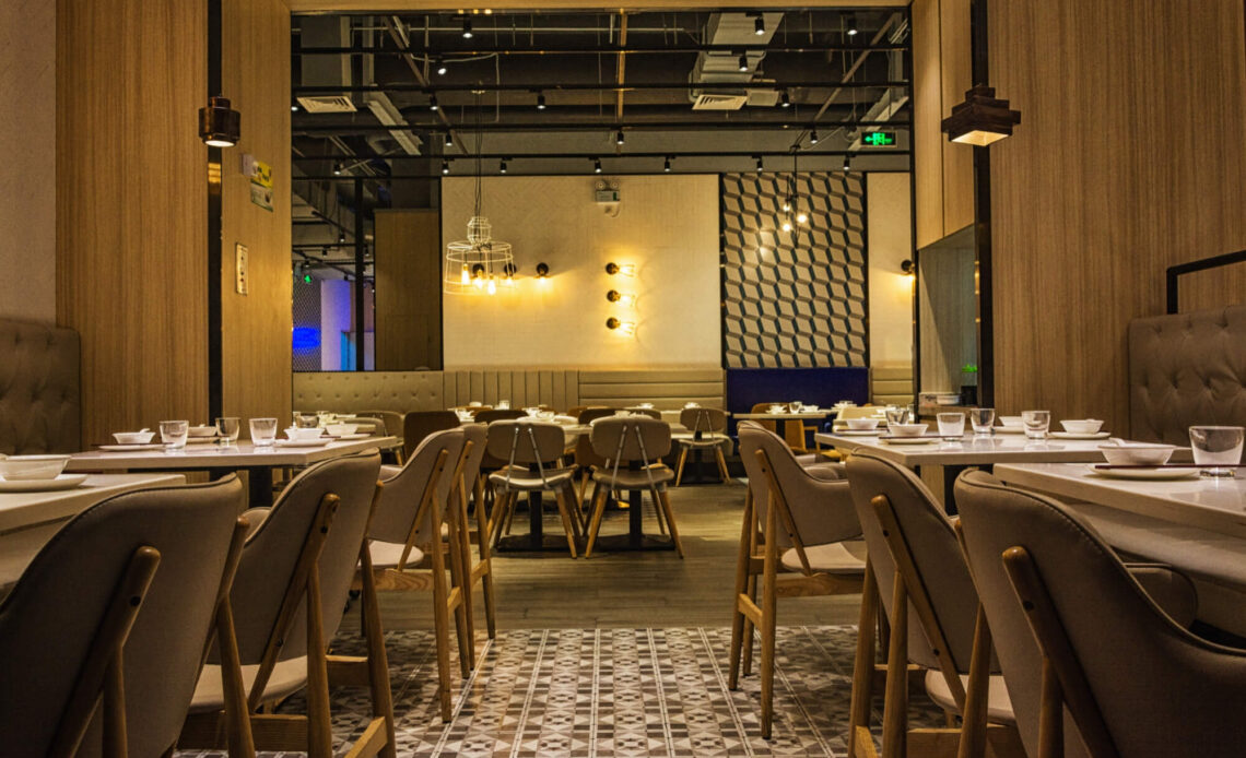
Creating a stylish restaurant doesn’t have to break the bank. I’ve always believed that great design is about creativity, not just a hefty budget. Whether you’re opening a new spot or refreshing an existing one, smart design choices can make a big impact without draining your wallet.
From clever layout tweaks to affordable decor upgrades, there are plenty of ways to transform your space into something inviting and memorable. A well-designed restaurant not only attracts customers but also keeps them coming back. Let’s dive into a few cost-effective tips to give your restaurant the charm and style it deserves.
Tip 1: Maximize Natural Lighting
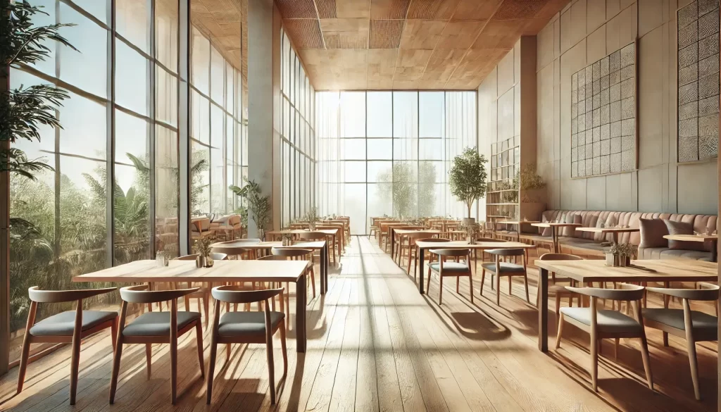
Enhancing natural lighting creates a warm, welcoming atmosphere while reducing energy costs. Thoughtful strategies can improve light flow and elevate the dining experience.
How To Use Large Windows
I make the most of large windows by keeping them clean and free of obstructions. Transparent or minimalistic design for window frames amplifies the entry of light. If privacy is a concern, frosted glass or window film retains brightness while maintaining discretion. Floor-to-ceiling windows are ideal for creating open, airy dining areas without costly renovations.
Choosing The Right Curtains Or Blinds
I select light, sheer curtains or roller blinds to complement the natural lighting. Neutral or pastel-colored fabrics diffuse harsh sunlight while preserving brightness. For stronger sunlight control, woven or bamboo blinds provide functionality without appearing heavy. Avoid thick, dark curtains that block light and create a closed-off feeling.
Positioning Furniture To Enhance Light Flow
Placing tables and chairs in areas that benefit most from natural lighting improves both visibility and ambiance. I avoid tall furniture or decor near windows, as they block light paths. Strategic arrangement of mirrors opposite windows reflects light, extending its reach throughout the space. Light-colored finishes on tables and seating further enhance the brightness of the dining area.
Tip 2: Incorporate DIY Decor
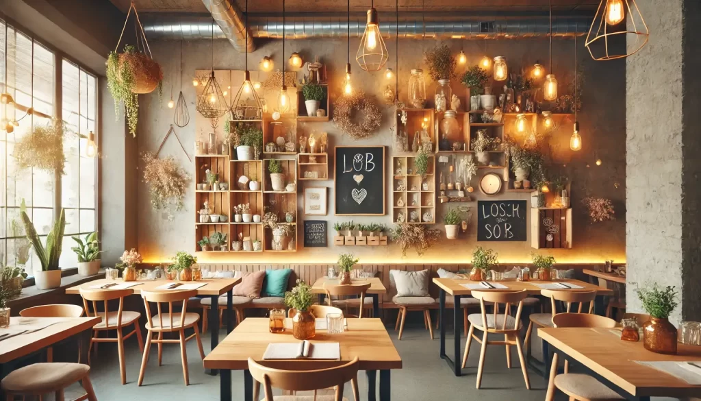
Adding DIY elements can significantly enhance a restaurant’s atmosphere while keeping expenses low. Handmade details create a unique, personal touch that customers appreciate.
Affordable DIY Projects For A Stylish Look
Creating visually appealing decor for less is possible with thoughtful DIY projects. I use wall-mounted shelves made from reclaimed wood as an affordable way to display plants, books, or decor items. Chalkboard paint on walls or wooden boards provides an interactive menu or art display. Adding string lights or homemade pendant lamps crafted from items like mason jars or wicker baskets establishes cozy and charming lighting.
Upcycling Furniture For A Unique Touch
Repurposing furniture adds character while reducing costs. I reimagine old wooden chairs with a fresh coat of paint or fabric cushions that match the restaurant’s theme. Using vintage doors as tabletops creates a rustic charm when paired with polished finishes. I also transform wine crates or wooden pallets into shelving units, planters, or even seating.
Tips For Sourcing Inexpensive Materials
Sourcing affordable materials while maintaining quality ensures budget-friendly designs. I explore thrift stores, flea markets, and online marketplaces for pre-owned items like furniture or decor pieces. Hardware stores often provide inexpensive wood scraps or paint samples suitable for smaller projects. Partnering with local artisans or recycling centers often yields unique, low-cost materials essential for creative DIY designs.
Tip 3: Use Color Strategically
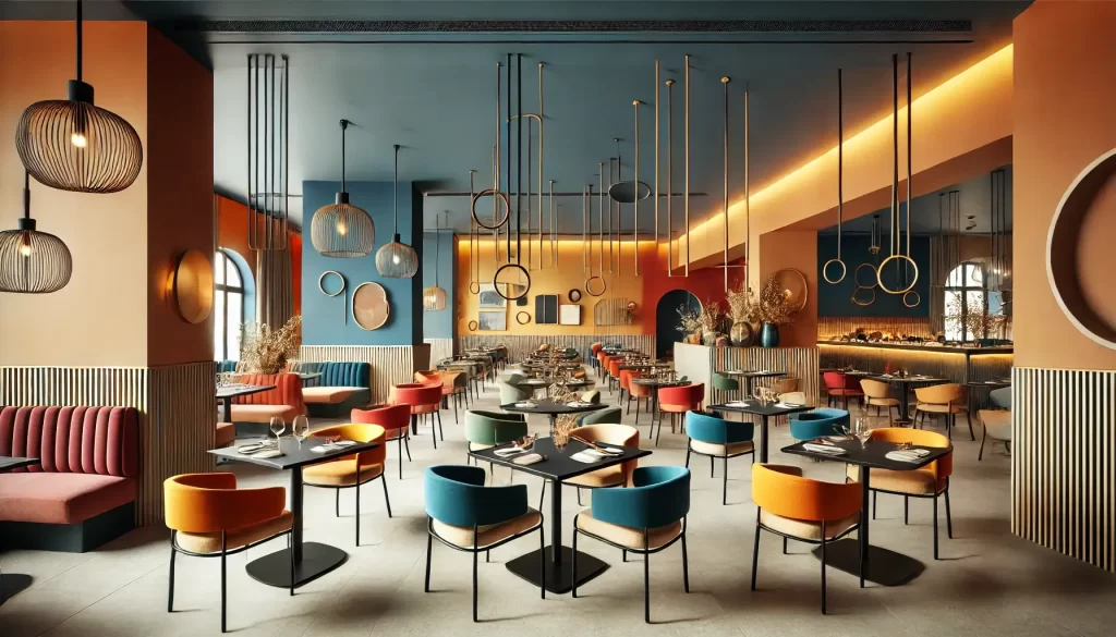
Color impacts the mood, perception, and overall ambiance of a restaurant. Using it wisely transforms the space without exceeding your budget.
Selecting A Cohesive Color Palette
Choosing a cohesive color palette unifies the restaurant’s design. I focus on 2-3 primary colors to create balance. For example, warm tones like terracotta or mustard evoke coziness, while cool tones like gray-blue or sage green promote a calm atmosphere. Neutral shades anchor the design, allowing accent colors to stand out. I ensure the palette aligns with the restaurant’s theme and target audience. For instance, a modern cafe benefits from minimalist black, white, and wood tones, whereas a lively eatery thrives with vibrant reds or yellows.
Adding Accent Walls Or Murals
Accent walls or murals add personality while keeping costs low. I use them to highlight key areas, such as a dining section or entryway. A single bold color like deep teal or maroon can make an impact, while simple, hand-painted patterns create texture. Instead of hiring professional artists, I work with local talent or employees with artistic skills to design murals. Typography-based designs, like menu-inspired words or slogans, are also cost-effective and visually appealing.
Cost-Effective Painting Tips
Efficient painting reduces expenses. I opt for durable, washable paints to minimize long-term maintenance costs, selecting semi-gloss or eggshell finishes for easy cleaning. I also use painter’s tape for precision, reducing the need for touch-ups. Purchasing paint from overstock or clearance sections provides quality at a lower price. For smaller spaces or unique effects, I incorporate DIY techniques like sponging or stenciling to enhance wall aesthetics economically.
Tip 4: Utilize Greenery
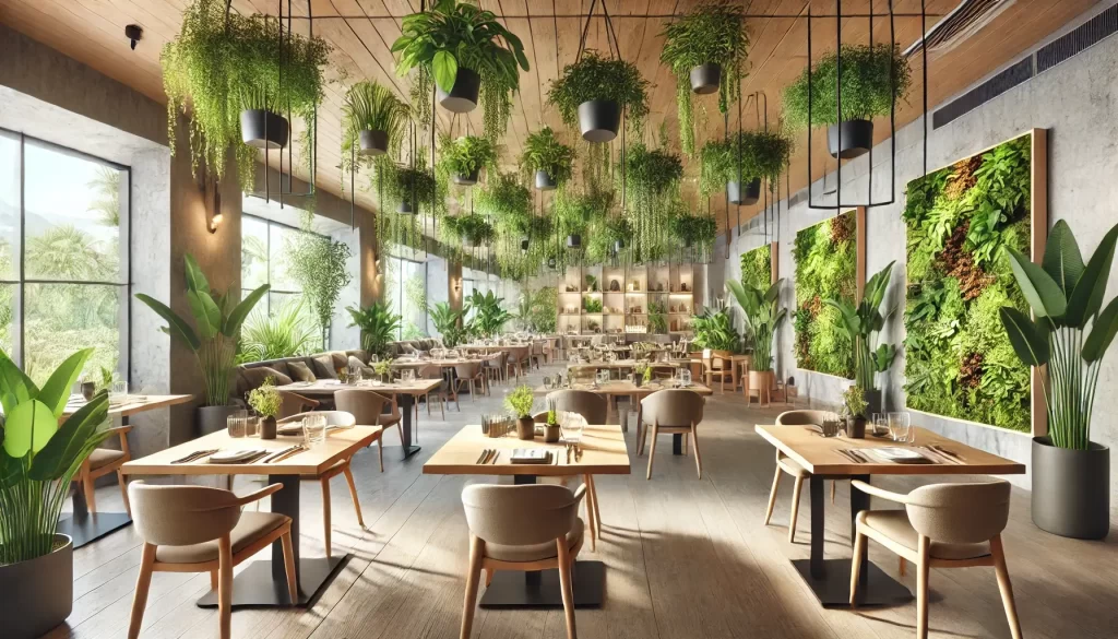
Adding greenery enhances a restaurant’s atmosphere, creating freshness and visual warmth without overspending. Thoughtful plant selection and smart displays maximize impact while keeping costs low.
Selecting Budget-Friendly Plants
I focus on low-maintenance, cost-effective plants such as pothos, snake plants, succulents, or peace lilies. These varieties thrive in indoor environments and require minimal care. Local nurseries and gardening stores tend to offer better deals than specialty shops. Bulk purchases or visiting plant clearance sections also help reduce costs.
Creative Plant Display Ideas
I use plant arrangements to double as decor. Hanging planters, tiered stands made from repurposed materials, or vertical wall-mounted gardens add depth and style. For example, I’ve transformed second-hand shelves or ladders into multi-level plant displays. Grouping plants strategically in corners or creating focal points above counters enhances the visual appeal. For tabletops, small potted plants serve as cost-effective, charming centerpieces.
Maintaining Indoor Plants On A Budget
Careful maintenance extends plant longevity while avoiding unnecessary expenses. Trimming dead leaves monthly keeps them healthy. Using diluted coffee grounds, banana peels, or homemade compost as fertilizer eliminates the need for costly plant food. I stick to drought-resistant species, reducing water usage. DIY solutions such as self-watering systems from plastic bottles ensure consistent hydration and save time. Proper placement in well-lit areas helps maintain growth without additional lighting equipment.
Tip 5: Focus On Functional Yet Stylish Layouts
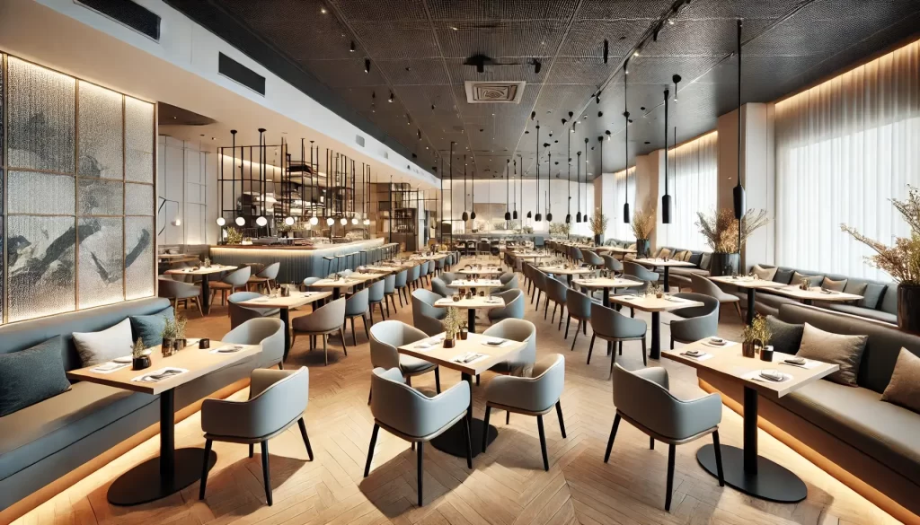
Creating a layout that balances functionality and style enhances both guest comfort and operational efficiency. Thoughtful design choices can ensure a better dining experience while saving costs.
Space Optimization Techniques
Maximizing every square foot increases seating capacity without making the space feel crowded. I arrange tables to create clear walking paths for servers and guests, avoiding oversized furniture that limits traffic flow. Using vertical space adds functionality, such as wall-mounted shelves for storage or decorative accents. Flexible seating arrangements, like benches or stackable chairs, adapt the layout for group sizes, reducing the need for extra furniture.
Choosing Affordable Yet Durable Furniture
Investing in budget-friendly, durable furniture prevents frequent replacements. I select materials like metal, plywood, or laminate for longevity, paired with stylish finishes to elevate the design. Preferring neutral-colored, modular furniture allows for mixing and matching, reducing the cost of replacements or expansions. Sourcing items from wholesale furniture suppliers, local artisans, or clearance sales keeps expenses manageable while maintaining quality.
Incorporating Multifunctional Elements
Integrating multifunctional elements maximizes utility and minimizes costs. I use tables with built-in storage, such as compartments for utensils or menus, to reduce clutter. Convertible furniture, like extendable tables and stackable stools, adjusts to varying guest needs. Adding decorative dividers doubles as space separators and aesthetic elements, optimizing ambiance and functionality in one solution.
Common Design Mistakes To Avoid
Mistakes in restaurant design can significantly impact both customer experience and operational efficiency. Here are common errors to watch for and how to address them.
Overcrowding The Space
Prioritizing seating capacity over guest comfort leads to a cramped and unpleasant environment. For example, tightly packed tables can hinder the flow of foot traffic and reduce privacy for diners. I ensure adequate spacing between tables, following local regulations of at least 24 inches for seating areas. Compact layouts work best when paired with sleek furniture and thoughtful arrangements that promote movement without sacrificing comfort.
Ignoring Maintenance Costs
Focusing solely on aesthetics while neglecting long-term maintenance increases expenses and affects the restaurant’s appearance. High-maintenance materials like porous stone tabletops or intricate light fixtures may look appealing but can become costly to clean or repair. I prefer durable, easy-to-clean surfaces like laminate or metal finishes and select fixtures with accessible designs for simpler upkeep. Factoring maintenance into the design process helps save money while maintaining a polished look.
Overusing Trends That May Date Quickly
Over-reliance on fleeting design trends can result in an outdated interior within a few years. Trending colors, themed wallpapers, or overly specific decor items may lose appeal and require frequent updates. I incorporate trends modestly, such as via small accent pieces or temporary decor. For core design elements like furniture and walls, I choose timeless styles and neutral palettes to future-proof the restaurant without frequent redesigns.
Conclusion
Creating a stylish and inviting restaurant doesn’t have to break the bank. With a bit of creativity and strategic planning, it’s possible to design a space that leaves a lasting impression on customers while staying within budget. Thoughtful choices in lighting, decor, color, greenery, and layout can completely transform the ambiance and functionality of your restaurant.
By focusing on timeless, practical, and cost-effective solutions, you can craft a space that’s not only visually appealing but also enhances the overall dining experience. Smart design is about making the most of what you have and investing in elements that truly matter.
Frequently Asked Questions
How can I design a stylish restaurant on a budget?
Focus on creativity and smart design choices. Use affordable decor options like DIY projects, upcycled furniture, and thrifted items. Optimize layouts and incorporate low-cost elements like plants, mirrors, and warm lighting to create an inviting ambiance.
How can natural lighting improve a restaurant’s design?
Natural lighting creates a warm, welcoming atmosphere and helps reduce energy costs. Use clean, unobstructed windows, sheer curtains, or reflective surfaces like mirrors to maximize natural light flow.
What are some easy DIY decor ideas for restaurants?
Try chalkboard-painted walls for interactive displays, string lights for cozy lighting, or reclaimed wood shelves. Upcycle old furniture with fresh paint or fabric cushions for added character and cost savings.
What are the benefits of adding plants to restaurant decor?
Plants bring freshness, warmth, and visual appeal to your space. Opt for low-maintenance varieties like pothos or succulents. Use creative displays like hanging planters or tiered stands for added impact on a budget.
How can I create a functional layout for my restaurant?
Maximize space by arranging furniture to maintain clear walkways and optimize seating arrangements. Use vertical storage and choose multifunctional furniture, like tables with built-in storage, for efficiency and style.
What colors work best for restaurant interiors?
Stick to a cohesive color palette of 2-3 colors. Warm tones create coziness, while cool tones promote calmness. Use accent walls or murals for affordable personality and collaborate with local artists for unique designs.
How do I choose durable and budget-friendly furniture?
Opt for materials like metal or plywood that are affordable and long-lasting. Source furniture from wholesale suppliers, flea markets, or local artisans to save money without sacrificing quality.
What are some common restaurant design mistakes to avoid?
Avoid overcrowding the space and ensure tables are placed with adequate spacing for comfort. Don’t overspend on fleeting trends; instead, focus on timeless designs and durable materials for long-term value.

